We recently linked up the game titles from our data set with available metadata from places like Steam and IGDB. As part of this, we’ve been playing around a lot with Steam tags. In this blog post, I’ll show you what happened when we tried to visualize how Steam tags are related to each other.
A Quick Word on Steam Tags
For every game on Steam, gamers can attach tags (i.e., keywords) on its webpage. The interface provides an autocomplete suggestion as you start typing, but users are allowed to enter any character string. So for example, on Europa Universalis IV’s page, the top tags are “Grand Strategy”, “Strategy”, “Historical”, etc. Steam shows the top 20 tags for every game, and the exact count of each tag can be found on SteamSpy.
To generate the data set, we looked up the Steam tags for all the game titles that have been mentioned at least 5 times in the Gamer Motivation Profile (with data from over 350,000 gamers) and exist on Steam—which came out to be 2,129 game titles. The Steam tags data we analyzed was gathered in mid-December 2017.
See how you compare with other gamers. Take a 5-minute survey and get your Gamer Motivation Profile
Defining Tag Relationships
There isn’t one “right” way of defining how close or similar two things are. For example, if we were to draw out a social network for someone, that graph would look different depending on whether we defined closeness as the length of each relationship, how much you cared about each person, how often you interact, or how geographically close you are.
We defined tags as being “close” if they tend to appear together across games at similar proportions.
The same is true here for the Steam tags data, and we present one reasonable approach of analyzing the data. In our analysis, we defined tags as being “close” if they tend to appear together across games at similar proportions. Or put another way, as we look at how Tag A is used across all the games, which other tags are used in the most similar proportions in those games?
Data Processing Notes
There’s a lot of data processing that goes on in any big data and network analysis, and we present the details here for data science folks or those who are curious. Others should feel free to skip this section.
The final data set consisted of 279 tags across 2,070 games.
Final Tally: We started with 321 tags across 2,129 games and the cleaned data set consisted of 279 tags across 2,070 games.
Visualizing Steam Tags: The Basics
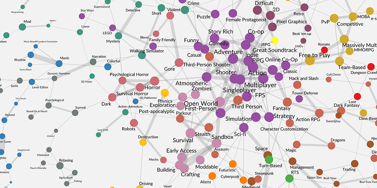
The network graph shows the strongest relationships for each tag. Here are the basics.
Dots represent tags. Lines represent how closely-related two tags are.
Dots represent tags. The bigger the dot/label, the more often that tag appears on Steam.
Lines represent how closely-related two tags are. The thicker the line, the higher the likelihood of appearing together in Steam games at similar proportions. For each tag, its most salient relationships are shown.

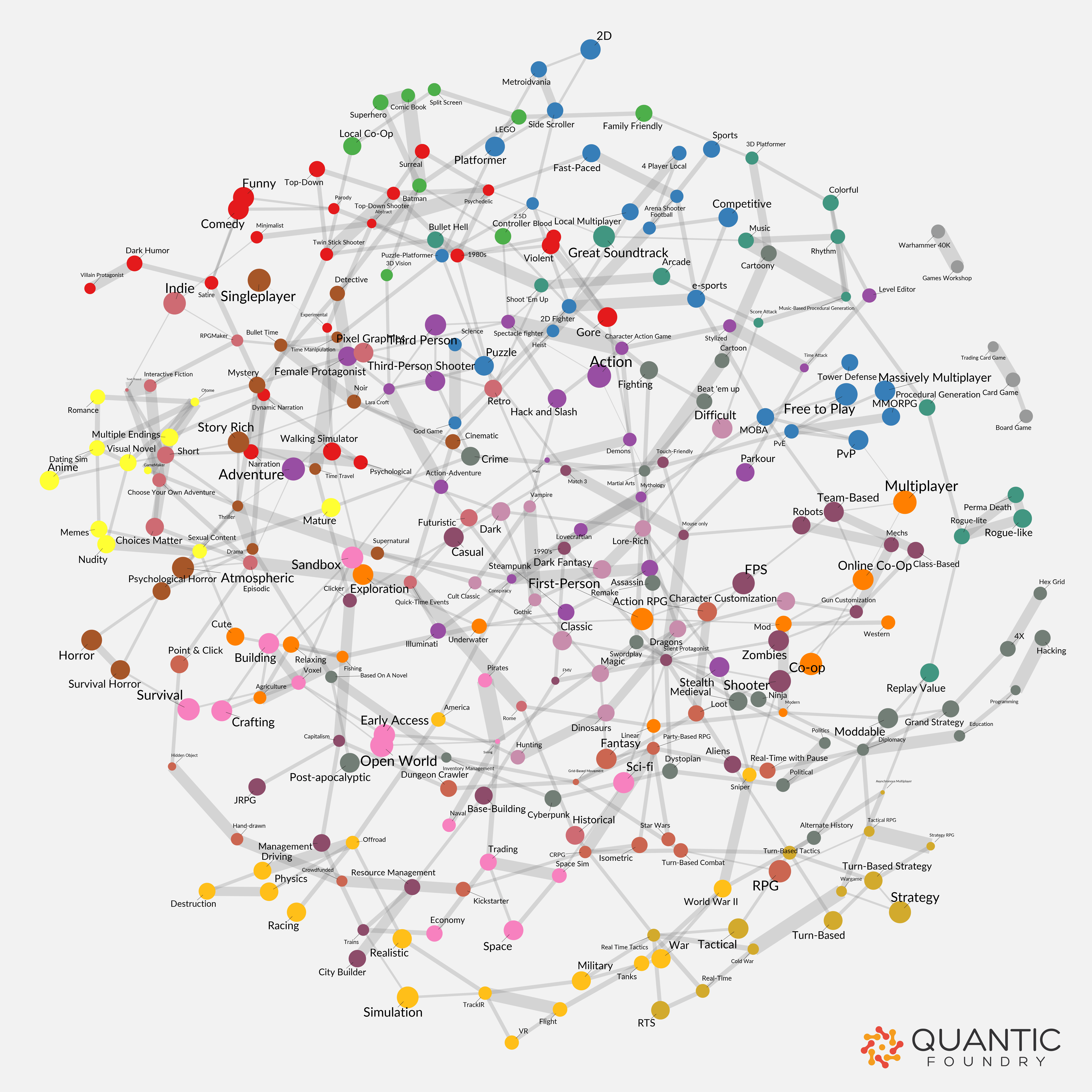
Want a hi-res version? You can download the hi-res version here. It’s 7500 x 7500 (1mb).
The layout algorithm tries to make every edge visible and about the same length. This means there aren’t hidden edges between overlapping dots (e.g., there isn’t a line hiding between “Space” and “Turn-Based”).
Colors represent local communities of highly-related tags. A community is a set of tags that form a cohesive subgroup via shared linkages, similar to identifiable cliques in a high school cafeteria. We identified 17 communities with more than 3 members, and each of these was given a different color.
Proximity between dots (if they are unlinked) does NOT indicate a relationship. Similar to how metro maps prioritize stop sequences rather than the actual distances traveled, the network graph optimizes linkage layout. For example, on the right edge of the map, “Hunting” is close to “Top-Down Shooter”, but because they are unlinked, their relative proximity is not an indication that these two tags are related.
Some Highlights To Jumpstart Your Own Exploration
There’s a lot going on in the chart, but here are some observations to help you explore.
Broad, mainstream tags are more central; niche tags are more peripheral. Because the most common tags tend to co-occur with other common tags, these tags are drawn together to form a dense, inner core. As the graph generation algorithm untangles all the knots, the graph quickly establishes a hierarchy from broad, mainstream tags to niche, granular tags. While the most generic tags are in the middle of the network (e.g., “Action”, Shooter”), the more niche and granular tags lie further away in the peripheries (e.g., “Romance” at the top).

Island Nations. Isolated tags form islands in the edges of the chart. These tend to be niche tags that are not well-connected to the main network. There are 9 islands in the chart, and 2 specific islands are worth pointing out. The “Superhero” island is notable for having multiple relatively-frequent tags that are nevertheless disconnected from the main network. And the “Board/Card Game” island has the distinction of being the only island with more than 3 nodes. The more nodes a community has, the more likely it will be connected to the main network. So it is rare to find large islands. This implies that these two groups of Steam tags (and their associated games) are very conceptually distinct from most video games.

Thick Connections Are Support Beams for Local Communities. The thickest edges within each community reveal the key features that anchor the community, like the support beams in a building. For example, the “Visual Novel” community is anchored by the beams related to “Anime-Romance”, the triangular beam of “Nudity-Mature”, and the beam of “Choices Matter-Multiple Endings”. In this sense, the chart visually distills genres into their key ingredients.

Next-Door Neighbors Reveal Pivot Points. Even though they are both in the Strategy genre, the Turn-Based Tactical community (green cluster) is distinct from the Economic Base-Building community (red cluster). Moreover, there are surprisingly few cross-over points between the two communities—they are held in close proximity by other nodes in neighboring communities. If you look closely, there are only 3 bridges between these neighbors: Medieval-Historical, RTS-Base-Building, and RTS-Economy. This provides a guideline on tried-and-tested ways to expand into a different community of players.

It’s a Roadmap of The Most Successful Recipes. As an aggregation of Steam tags across the roughly 2,000 most popular Steam games, the chart creates a roadmap of game features and themes that have been successful combinations. Starting with every dot, the nearest 1-hop tags represent the best bets to make in terms of both gamer expectations and combinations that have proven to be successful. The nearest 2-hop and 3-hop tags (particularly when crossing communities) are then more risky bets that may nevertheless create new and appealing gaming spaces (especially when the intermediate nodes are included to create a cohesive experience).
The chart creates a roadmap of game features and themes that have been successful combinations.
Let’s say we’re exploring what different demographic segments buy at supermarkets. Well, if we look at the raw data, it’ll turn out that every market segments tends to buy milk and bread at supermarkets because the base rates of certain products is so high. Instead, we can calculate the products that each segment is disproportionately most likely to buy (compared to the average). For example, very few people buy melatonin pills at the supermarket, but 25-40 year old business travelers are 20 times more likely than average to buy melatonin pills.
We can apply the same logic to the Steam tags. Instead of finding the tags that appear in the most similar proportions, we can look instead for tags that are disproportionately most likely to appear with each tag (i.e., the local frequency divided by the baseline frequency).
Here’s what that chart would look like. Notice that the most frequent tags (like “Action”) are now spread all over the graph. And there are many more connections between tags of dissimilar sizes, which results to a more interconnected graph. You can download the hi-res version here.

Neither graph is more “correct” than the other. Consider the frequently-used tag “Singleplayer”. Do you feel it ought to be highly-connected to other frequently-used tags like “Adventure”, or should its connections be heavily penalized precisely because it’s such an overused tag? The former emphasizes the world as it really is, while the latter emphasizes more subtle and hidden connections.
So it depends on how you’re trying to make use of the graphs. For brainstorming new possibility spaces for games (as we mentioned in the “Roadmap” point above), the latter map would likely yield more interesting combinations due to the higher number of interconnections, while the former map better reflects the state of the world on Steam.
See Something Interesting in the Chart?
If you find other interesting areas of the chart, let us know in the comments below.
Interesting analysis. What would really help exploration “on your own” is a searchable graphic, like a PDF with OCR. It’s difficult to find tags in either version as the zoom is either too large to see many at once or too small to use.
Good suggestion about searchable PDF. We’ll look into that and see if we can put one together.
Great article!
One thing I see that I find interesting are the dead-ends. For instance “Trains” on the end of the “Economy” hub, or “Sniper” on the end of “World War II”. In the case of the former, is it an unexploited niche to let gamers play at trains without necessarily managing economy/efficiency etc? Surely, there are other ways to play with trains. In the case of the later, I am certain that there are “sniper” games that exist outside just the WWII genre – is this an oversight, or are gamers who like playing at sniping not tagging the other genres, and if so, why not?
Anyways, great work, thanks for posting.
Play The Last Train on Steam .
Impressive! One more question, can we do some “trend analysis” based on the “change” of the tags so that somehow we could predict the future “new/popular gameplay”?
SteamSpy contains only snapshot data (i.e., the current data), so we’d need to put together a regular-interval data-scraping mechanism to track changes over time. We’ve been chewing on this as well.
Is there a colour key / list for all the communities you mention e.g. Turn-Based Tactical community (green cluster)?
Thanks for asking about this. We went ahead and added a new toggle list titled “Which 17 Communities Did We Find?” It’s near the middle of the post (or search in browser).
Thanks for another amazing article. SO interesting to see the clusters. I wish the industry would re-define some genres. For example, Strategy and RPG are too large and contain fairly distinct communities.
Hi Nick,the article is quite interesting. However, according to the Next-Door Neighbors Reveal Pivot Points, do you think this will narrow down the horizon of game’s recommendation? I mean do you think this is bad for gamer to explore their tastes but playing the same kind of games all the time?
Hi, very interesting work. Can you explain the distance metric you use in a bit more detail? I am not sure how the normalized count values are used to compute the distance. Thanks!